Title here
Summary here
Hover buttons allow visitors to interact with gallery images directly from the thumbnail view. You can add:
The setup differs slightly between Classic and Fusion galleries.
In Classic galleries, hover buttons are configured inside:
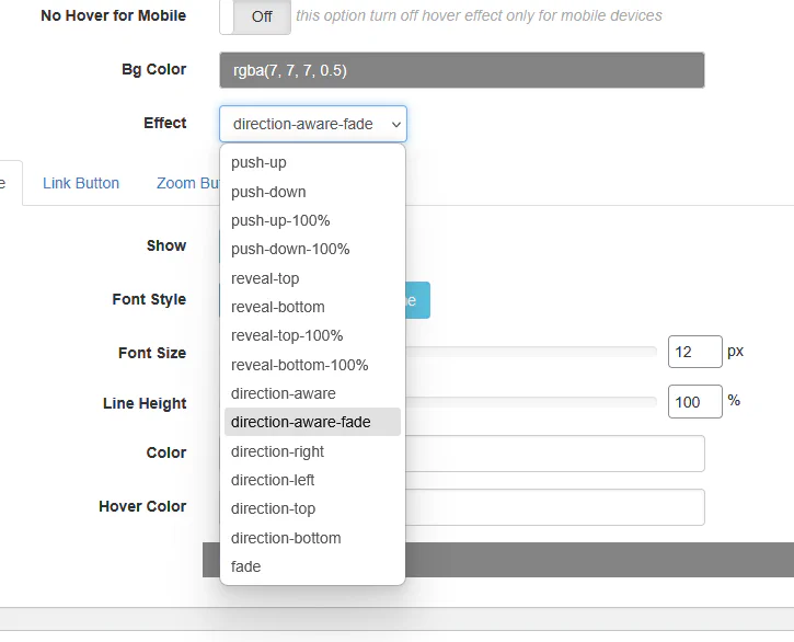
THUMBS → Hover Options
Make sure:
Hover Mode → Options Clickable Thumbnails → On (optional)
Open the Link Button tab.
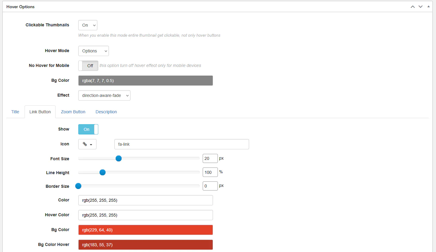
You can configure:
To make it work, assign a custom link to the image inside Media Manager.
Open the Zoom Button tab.
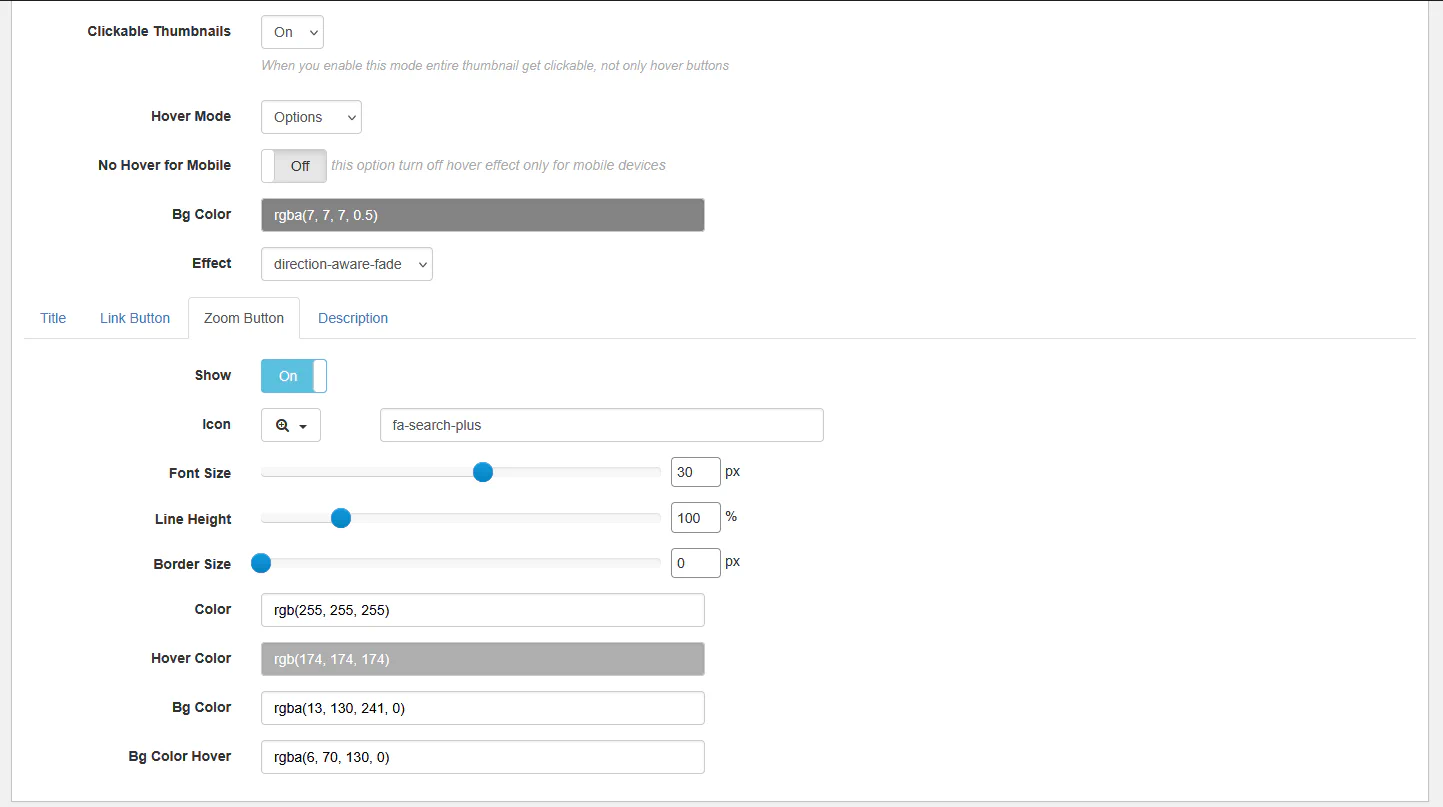
This button opens the image in the lightbox.
You can configure:
In Fusion galleries, hover buttons are already integrated inside the hover template.
Go to:
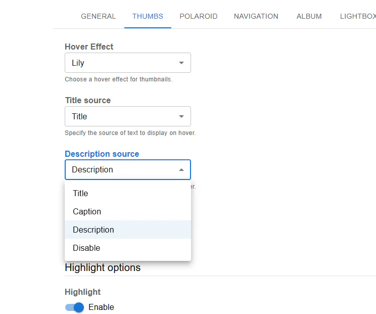
THUMBS → Hover Effect
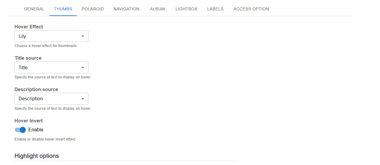
Fusion provides predefined hover layouts like:
Each template may already contain:
If you need full control:
Hover Mode → Template
Example:
<div class="rbs-hover-title">@TITLE@</div>
<div class="rbs-hover-caption">@CAPTION@</div>
<div class="rbs-hover-text">@DESC@</div>
<div class="rbs-hover-more">
  <a href="@LINK@" target="_blank">Read More</a>
</div>
Available placeholders:
@TITLE@@CAPTION@@DESC@@LINK@@VIDEOLINK@
Inside Link or Zoom button tabs you can customize:
| Gallery Type | Button Method |
|---|---|
| Classic | Built-in Link & Zoom buttons |
| Fusion | Integrated hover templates |
| Classic (Advanced) | Custom HTML template |
Now your hover overlays are not just decorative — they’re interactive.