Title here
Summary here
The Masonry Layout in Robo Gallery (Fusion Grid, v5) is designed to display images in a dynamic, fluid grid where items are arranged vertically or horizontally based on their natural proportions. This layout is ideal for galleries with images of different aspect ratios and creates a modern, visually balanced appearance.
Fusion Masonry layouts are fully responsive, optimized for performance, and automatically adapt to different screen sizes — from mobile devices to ultra-wide and Retina displays.
Fusion Grid supports two Masonry layout variations:
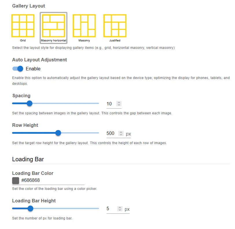
In Horizontal Masonry, images are organized in rows with flexible widths. Each row adjusts dynamically to fill the available space while maintaining image proportions.
Best for:
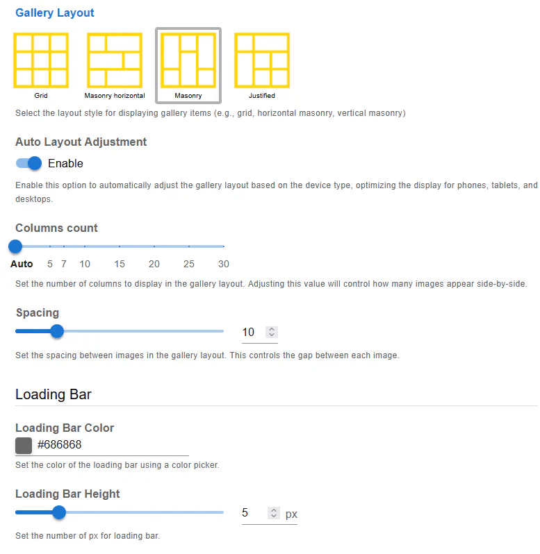
In Vertical Masonry, images are stacked in columns with flexible heights. The layout flows vertically and fills gaps automatically.
Best for:
You can switch between these layouts at any time in the gallery settings.
Auto Layout Adjustment enables Robo Gallery to automatically adapt the Masonry layout based on the visitor’s device.
When enabled:
This option is strongly recommended for most use cases.
The Columns Count setting controls how many columns are displayed in the Masonry layout.
Options include:
Using Auto ensures the best responsiveness, especially for mixed screen resolutions.
The Spacing option defines the gap between images in the Masonry layout.
Spacing is applied consistently across all devices.
For Horizontal Masonry, the Row Height setting defines the target height for each row.
This option is not used in Vertical Masonry.
Fusion Masonry layouts include a built-in Loading Bar, which visually indicates image loading progress.
You can customize the color to match your website’s branding.
Defines the thickness of the loading bar in pixels.
The loading bar improves user experience, especially for galleries with a large number of images.
Fusion Masonry layouts are built with modern frontend technologies and include:
The layout automatically scales from small mobile screens up to Ultra HD and 16K displays, fully Retina-compatible.
Masonry layouts are recommended when:
Fusion Masonry layouts require minimal manual configuration while delivering maximum flexibility and visual quality.