Title here
Summary here
Hover effects in Robo Gallery allow you to control how information appears over thumbnails. You can adjust animations, colors, text sources, layout structure, and even create fully custom templates.
Hover customization is available in both:
Go to:
THUMBS → Hover Options
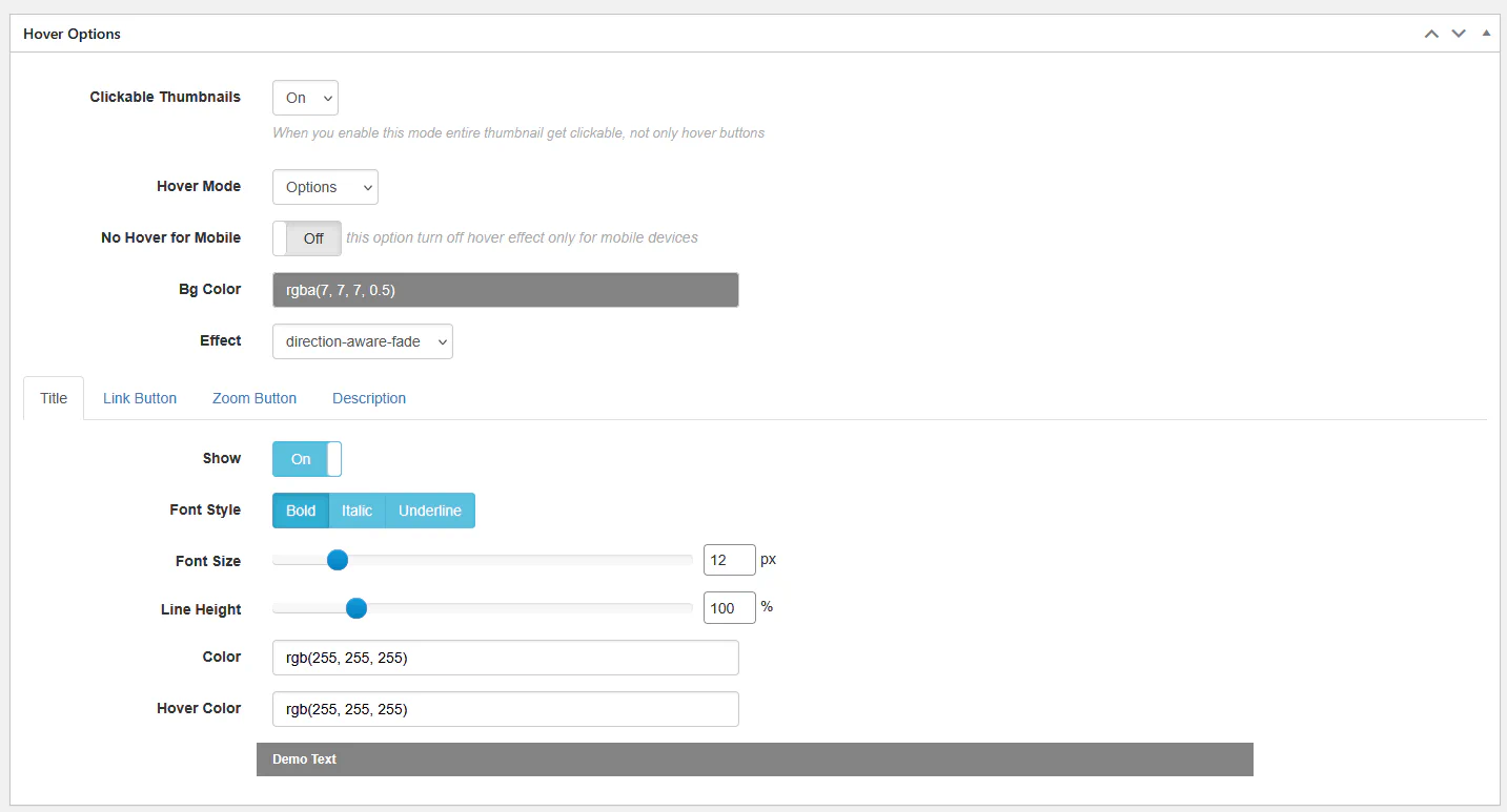
When enabled, the entire thumbnail becomes clickable. This improves usability and is recommended when linking to pages or lightbox views.
Available modes:
In Options mode, you can choose different animation styles:
These animations control how overlay content appears and disappears.
You can customize:
Example:
rgba(7, 7, 7, 0.5)Using semi-transparent backgrounds improves text readability.
You can configure:
This allows full branding alignment with your theme.
If you need total control, switch to Template mode.
Example template:
<div class="rbs-hover-title">@TITLE@</div>
<div class="rbs-hover-caption">@CAPTION@</div>
<div class="rbs-hover-text">@DESC@</div>
<div class="rbs-hover-more">
    <a href="@LINK@">Read more</a>
</div>
Available variables:
@TITLE@@CAPTION@@DESC@@LINK@@VIDEOLINK@Template mode is ideal for:
Go to:
THUMBS → Hover Effect
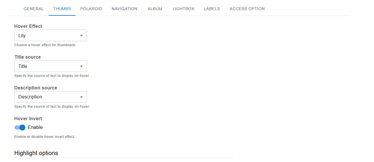
Fusion provides modern predefined styles:
These presets define animation and layout behavior automatically.
You can choose what content appears on hover:
This gives flexibility depending on how your media is structured.
Fusion allows detailed control over:
RGBA values are supported for transparency control.
Example:
rgba(0, 0, 0, 0.71)Classic Gallery includes:
No Hover for Mobile → Enable
Since mobile devices do not support traditional hover interactions, disabling hover improves usability and avoids UI conflicts.
For better hover experience:
Hover customization in Robo Gallery allows you to:
With proper configuration, hover effects can significantly enhance engagement and visual impact.