Title here
Summary here
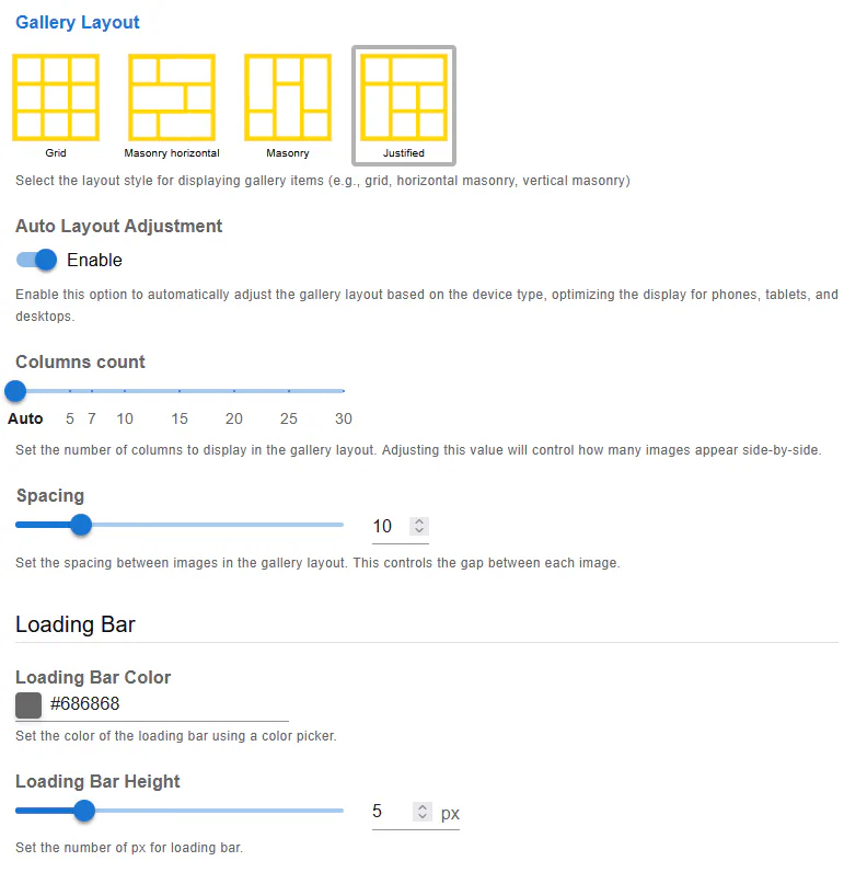
The Justify Layout in Robo Gallery (Fusion Grid, v5) arranges images into clean, aligned rows where each row stretches horizontally to fill the full available width of the gallery container. This layout creates a structured, magazine-style appearance while preserving the original proportions of images.
Justify Layout is fully responsive, performance-optimized, and works seamlessly across all devices — from mobile phones to ultra-wide and Retina displays.
In Justify Layout:
This results in a balanced, professional-looking gallery with consistent horizontal alignment.
When Auto Layout Adjustment is enabled, Robo Gallery automatically adapts the Justify layout based on the visitor’s screen size.
This includes:
This option is recommended for most galleries.
The Columns Count setting controls how many images are displayed side-by-side within a row.
Available options:
Using Auto ensures the most flexible and responsive behavior.
The Spacing option defines the horizontal and vertical gap between images.
Spacing is applied consistently across all rows and devices.
Justify Layout includes a built-in Loading Bar that improves perceived performance and user experience.
Allows you to customize the color of the loading indicator to match your site design.
Defines the thickness of the loading bar in pixels.
This feature is especially useful for galleries with many images.
The Justify Layout benefits from all Fusion Grid optimizations, including:
Even galleries with a large number of images remain fast and responsive.
Justify Layout is ideal when:
This layout works particularly well for photography portfolios, blogs, editorial websites, and corporate presentations.
The Justify Layout offers:
Combined with Fusion Grid’s automation and optimization, it delivers a modern and reliable gallery experience across all devices.