Title here
Summary here
The Polaroid layout in Robo Gallery allows you to display images in a classic photo-style frame with additional textual and interactive elements. This layout exists in two different implementations, depending on the gallery version and type.
Robo Gallery supports two Polaroid modes:
Each mode offers a different level of flexibility and functionality.
The classic Polaroid layout is available in gallery versions up to v3 and can also be selected directly as a gallery type.
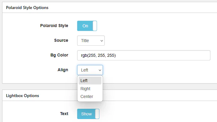
You can choose one of the following image fields:
TitleCaptionDescriptionThis text is shown below the thumbnail as part of the Polaroid frame.
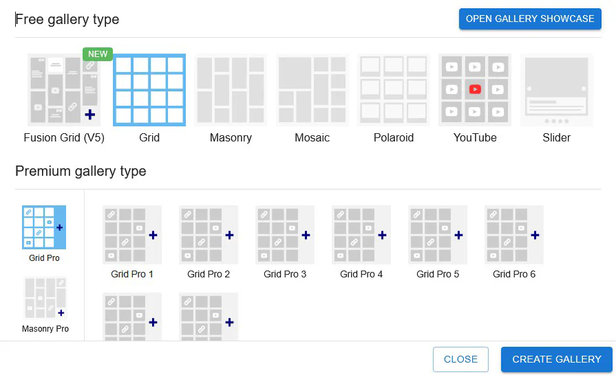
When selecting Polaroid as a gallery type in the gallery creation dialog, the classic Polaroid layout will be used.
Fusion Polaroid is part of the Fusion Grid (v5) and represents a next-generation Polaroid layout with extended customization and modern UI elements.
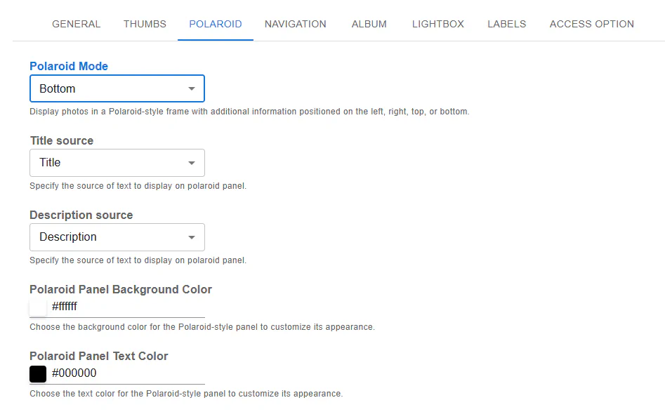
The Polaroid panel can be displayed in multiple positions:
This allows you to adapt the layout to different designs and screen sizes.
Unlike the classic version, Fusion Polaroid supports two independent text fields:
Each field can be mapped independently to:
Fusion Polaroid panels can include:
These elements improve usability and interaction directly from the gallery view.
You can customize:
| Feature | Classic Polaroid (v3) | Fusion Polaroid (v5) |
|---|---|---|
| Panel position | Bottom only | Top / Bottom / Left / Right |
| Text fields | One | Two (Title + Description) |
| Text source options | Title / Caption / Description | Title / Caption / Description |
| Interactive icons | No | Yes |
| Styling flexibility | Limited | Advanced |
| Technology | Legacy | Modern (Fusion Grid) |
Both modes are fully responsive and compatible with mobile devices, but Fusion Polaroid provides enhanced responsiveness and better adaptation to modern screens.