Choosing a Hover Template

Hover effects in Robo Gallery allow you to display additional information and interactive elements when users move their mouse over thumbnails.

Hover settings differ between:

  • Classic Gallery
  • Fusion Gallery

Classic Gallery – Hover Configuration

Go to:

THUMBS → Hover Options

Classic Hover Options


Clickable Thumbnails

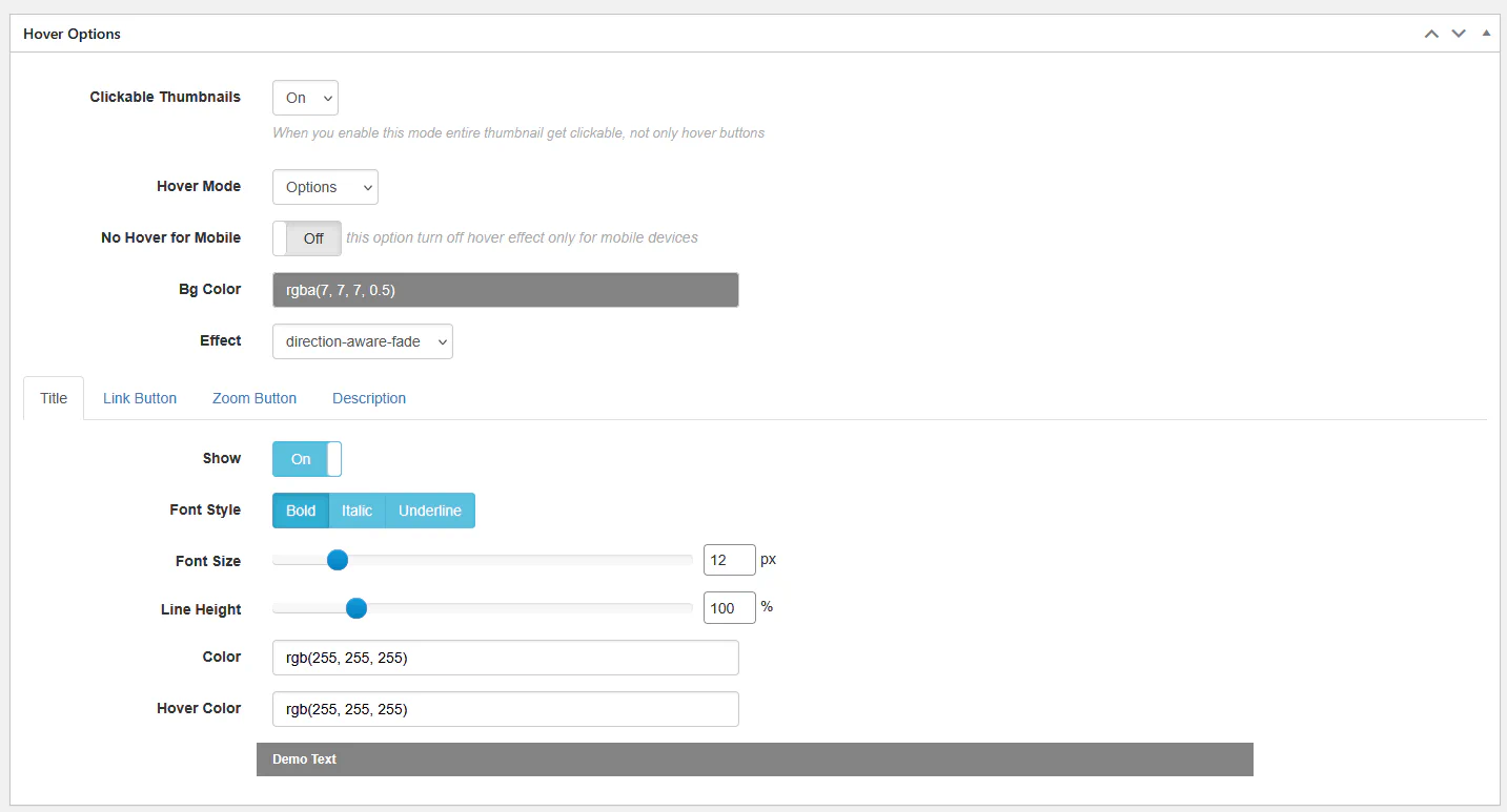
When enabled, the entire thumbnail becomes clickable — not only hover buttons.
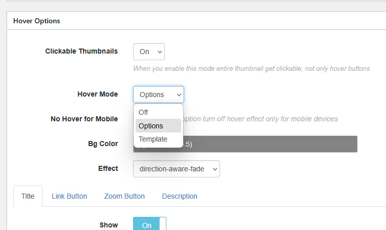

Hover Mode

Classic Hover Mode

Available modes:

  • Off – disables hover completely
  • Options – standard hover configuration
  • Template – custom HTML layout

Hover Effects (Options Mode)

Classic Hover Effects

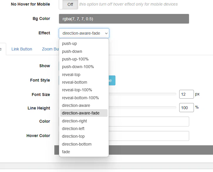
Available animation styles:

  • push-up
  • push-down
  • push-up-100%
  • push-down-100%
  • reveal-top
  • reveal-bottom
  • reveal-top-100%
  • reveal-bottom-100%
  • direction-aware
  • direction-aware-fade
  • direction-right
  • direction-left
  • direction-top
  • direction-bottom
  • fade

These control how overlay content appears.


Template Mode (Advanced)

Classic Hover Template

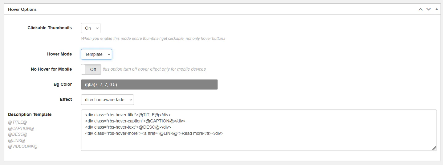
When using Template mode, you can define a fully custom HTML layout.

Available variables:

  • @TITLE@
  • @CAPTION@
  • @DESC@
  • @LINK@
  • @VIDEOLINK@

Example template:

<div class="rbs-hover-title">@TITLE@</div>
<div class="rbs-hover-caption">@CAPTION@</div>
<div class="rbs-hover-text">@DESC@</div>
<div class="rbs-hover-more">
    <a href="@LINK@">Read more</a>
</div>

Use Template mode when you need maximum flexibility.
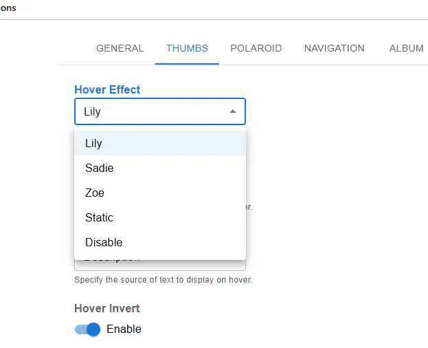

Fusion Gallery – Hover Effects

Go to:

THUMBS → Hover Effect
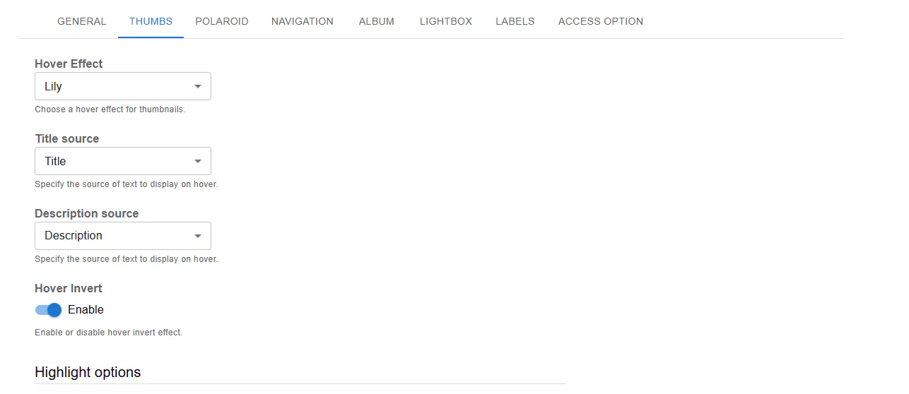
Fusion Hover Effect

Available presets:

  • Lily
  • Sadie
  • Zoe
  • Static
  • Disable

Title and Description Source

Fusion Title Source

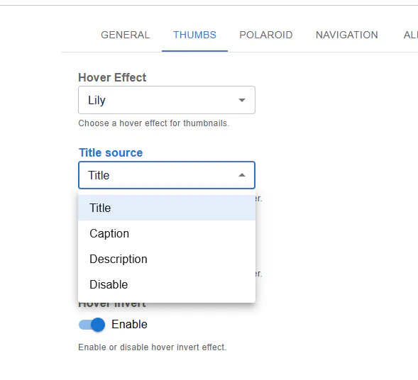
For both Title source and Description source, you can choose:

  • Title
  • Caption
  • Description
  • Disable

This defines what content appears on hover.
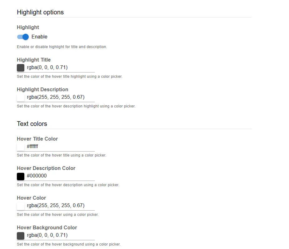

Highlight Options

Fusion Highlight Options

You can enable:

  • Hover Invert
  • Highlight
  • Custom highlight colors
  • Custom text colors
  • Hover background color

Hover Color Customization

Fusion Hover Colors

Fusion allows detailed color control:

  • Hover Title Color
  • Hover Description Color
  • Hover Background Color
  • Highlight Title Color
  • Highlight Description Color

This makes it easy to match hover overlays to your website design.


Mobile Behavior

In Classic Gallery you can disable hover for mobile devices:

No Hover for Mobile → On

This is recommended because mobile devices do not support traditional hover behavior.


Summary

Hover templates allow you to:

  • Display titles and descriptions
  • Add buttons and links
  • Customize animations
  • Fully control layout (Classic Template mode)
  • Apply modern preset effects (Fusion)

Proper hover configuration improves engagement and makes your gallery more interactive.